
ABSTRACT
This paper analyses how providers have coped with the 4-hour target over the past 7 years. To do this, we used publicly available data from NHS Digital to track how long patients remain in accident and emergency (A&E) departments and their ‘attendance disposal method’. Using this tool, we compared two A&E departments with similar arrival patterns and age profiles and that perform equally well against the target in a specific year. However, these hospitals exhibit very different underlying behaviour. Over 7 years, both exhibit a general increase in length of stay, increasing number of patients being admitted in the 20 minutes preceding the 4-hour target, and rising numbers of patients that breach the target. Despite the two hospitals having similar input profiles there is a 12 percentage point difference in the number of patients who leave the A&E department in the last 20 minutes. This operational information is not visible simply by monitoring the single existing metric. We conclude that the 4-hour target in isolation is an inadequate measure and we reflect on the difference between selecting measures for policy-level review, and for operational management. A link to download the graphs for each A&E in England is available.
Introduction
In 2004, the NHS Plan introduced a target that 98% of patients attending a hospital accident and emergency (A&E) department should be seen, treated and discharged within 4 hours of arrival.1,2 In 2010, the target was revised to 95% and this remains a key measure of hospital performance. A set of balanced indicators3 that incorporated, among other metrics, unplanned re-attendance rates, the number of patients that left without being seen and the times to initial assessment and treatment were proposed and adopted for local use but not adopted as national targets. At one level, the 4-hour target has been an amazing success, improving the delays in care prevalent in the 1990s and setting a uniform expectation of service for millions of patients in the UK. It has also been important in driving research into the mechanics of urgent care provision and the connection between urgent care facilities and the wider care systems. On the other hand, more than a decade after its introduction, the measure has proved far from sustainable, many A&E departments continue to breach the relaxed target and overall performance against the measure continues to deteriorate. Monitor, now part of NHS Improvement, reviewed the decline in meeting the 4-hour target over the winter of 2014/15 compared with the previous winter.4 They concluded that the increase in the numbers of patients that were admitted from A&E, the bed occupancy of downstream wards and the increase in the number of arrivals by ambulance had all been contributing factors.
Because A&Es are a ‘barometer’ of the whole healthcare system, it is important to understand what is happening in the A&E; this is difficult if the sole focus of measurement is around a single point, namely 4 hours. While a threshold value is easy to understand and report on, there is a danger that we simply focus on ‘above’ or ‘below’ the threshold, and do not take into account the context in which results occur. This has two aspects – what conditions contributed to meeting or failing to meet the target and whether the clinical response, quite apart from the target, was appropriate or not. Some of this context is available in the form of the method of ‘disposal’, which records whether a patient was admitted, discharged or referred following their A&E visit; however; this is not generally reported on alongside the 4-hour target.
A consultant physician summed up these aspects as followsThe huge failing in the 4hr target, in my opinion, was that the only outcome valued was ‘the patient out of the A&E at 4hrs’ (private communication, 2016).
In an effort to meet the target, one strategy has resulted in the emergence of the medical assessment unit (MAU) into which urgent care patients may be transferred rapidly for up to 48 hours, during which time they receive focused care. Ideally, the patient leaves the hospital after that and the time spent in the MAU does not contribute to the patient's length of stay in the A&E department. However, while admitting a patient to an MAU may ‘stop the clock’ as far as the 4-hour target is concerned, it may not represent a significant improvement in the quality of care or redesign of the service or reduction in A&E workload. Various strategies have been introduced, some are beneficial for patients but others aim to improve the target alone. They include re-prioritising patients, but not in order of their clinical need, putting the most senior consultant as the first decision-maker that the patient encounters, and even data manipulation.5–8 While there is undoubtedly evidence of rounding times down, this is not to suggest that staff are deliberately misrepresenting reality or providing poorer levels of care. Sometimes records are filled in retrospectively, for instance, once the rush is over.
We contend that a single target, such as 4 hours, is a poor measure for operations management,9 offering limited insight into what is happening and being open to ‘gaming’. Moreover, when a single target is highly performance managed then it can produce perverse effects such as an increase in financial deficit in order to meet the target. Even as a monitoring measure, the 4-hour wait target may not be ‘helpful’ if it is linked to a policy of punishment or reward – especially if there is evidence that the metric is not differentiating between high and poor performance. If operational managers are to be subject to a simple threshold measure to determine whether their performance is satisfactory, then they will require more sophisticated measures to see beyond the simple threshold. It is important that they understand what pressures may be building up, even behind a track record of apparent consistent success. The aim of these more sophisticated measures would be to help achieve improved patient flow evenly across the 4 hours rather than the present target, which is shown to incentivise discharges in the last 20 minutes before the 4-hour mark.
In this paper, we present publicly available data in such a way as to reveal trends that are not visible when simply considering the 4-hour target. We select two hospitals whose 4-hour performance is similar and then look behind the headline metric. Our contribution is to provide the means for operational managers to more closely analyse the data around the 4-hour target, by generating graphs and visualising trends over a 7-year period (2008–15). We hope that this will provide insights and offer more in the way of diagnosis and prognosis of A&E performance.
A new metric for A&Es would require a broader debate and probably the collection of more data, which is beyond the scope of this paper. However, by looking at the data over the past 7 years and by using different visualisation techniques, we identify new trends from the existing data. We hope to use this to guide thinking on appropriate and useful measures for the future.
Method
For this analysis we used the publicly available Health Episode Statistics data (accident and emergency attendances in England - provider level analysis) from 2008/09 until the most recently published data (2014/15) – from January 2017, the data file (for 2015–2016) will be called ‘hospital accident & emergency activity’ and therefore may vary in terms of content reported. Prior to publication, the data are extensively ‘cleaned’ by NHS Digital analysts to prevent any patient identification, resulting in some records being suppressed when it is not possible to guarantee anonymity (typically when fewer than five cases are concerned). Each year's data can be downloaded as a separate spreadsheet file from the NHS Digital website, covering April–March for each (financial) year, although each year's data do not become publicly available until the following January. Each downloadable spreadsheet also contains 10 tables detailing one aspect of A&E performance listed by provider (eg number of A&E attendances by hour of arrival for each provider). In addition the ‘output’ tab can display a comparison of up to three different trusts or areas (depending on the year selected) and, where available, the previous years’ data are also displayed in tables (although not graphically). While this is interesting, we have taken a longer-term view that it is more informative to look at how a single A&E's performance has changed over time and to combine the available data to provide a more in-depth understanding of what aspects of the A&E performance have altered.
We downloaded 7-years’ worth of provider-level A&E data, amalgamating four of the tables (number of A&E attendances by hour of arrival, number of A&E attendances by duration, number of A&E attendances and method of discharge by duration, and average length of stay by hour of arrival) to provide a longitudinal view of an individual trust's performance. We developed a spreadsheet tool that allows the user to select an individual trust or area from a drop-down list and display the information around the 4-hour target associated with the selection over a 7-year period.
As trusts combine and change their names over time, a lookup table containing the three letter code for each trust over the 7-year period was developed. When trusts combine, a new code may be generated and old codes become redundant; therefore, not all trusts will have 7-years’ worth of data. The tool then uses the three letter code from the lookup table to identify the data associated with that trust. The data, for all the years available, is then displayed graphically showing how the profile of discharges has changed over the available period, supporting a far more intuitive understanding of the changes than can be provided by tables alone. Any ‘missing’ or ‘supressed’ data are labelled as ‘missing’ (as it is not always easy to identify when data have been suppressed or are missing).
When is the same performance not the same performance?
To explore how this spreadsheet can provide insight, we selected two trusts (Hospital A and Hospital B) based on the fact that they have a similar age and arrival profile, and reported a similar percentage of breaches (4.68% and 4.49%, respectively) against a 4-hour target of 95% (Fig 1) for the year 2014–15 despite Hospital A having approximately 37% more patients in total (148,999 versus 108,698).
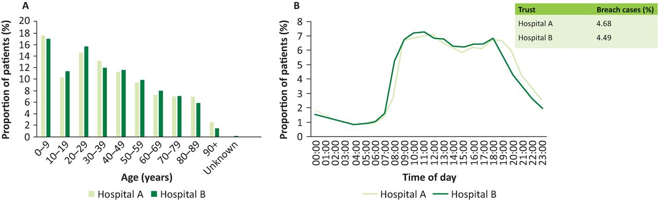
Age (A) and arrival time (B) profiles of patients at Hospital A and Hospital B reported for year 2014–15. Data from NHS Digital.
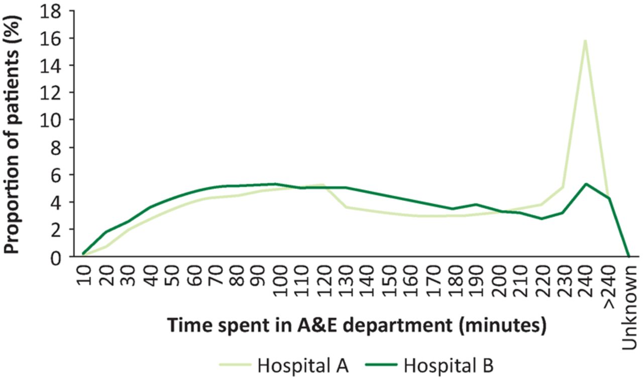
While these hospitals appear to be performing similarly if we consider only the percentage of A&E visits breaching the 4-hour target, if we compare the percentage of patients that spend between 3 hours 40 minutes and 4 hours in the A&E we observe a noticeable difference: 20.83% for Hospital A versus 8.56% for Hospital B. This discrepancy is immediately obvious if we plot the profile of patients leaving the A&E in each case in 10 minute intervals, averaged over the year (Fig 2). There is a peak where 15.82% of patients are discharged in the last 10 minutes of the 4-hour target at Hospital A, which is absent in the case of Hospital B. What is interesting is that prior to 3 hours 20 minutes in the A&E, the length of stay profiles are very similar, with <1% variation between the two data sets.

Profile of the time that patients spent in the accident and emergency (A&E) departments of Hospital A and Hospital B reported for year 2014–15. Data from NHS Digital.
It is in cases such as this that the 4-hour target in isolation may be misleading and, more importantly, looking at a single year in isolation may mean that we are missing trends that could provide insight into systemic problems. By comparing the two hospitals over 7 years (Fig 3), we see that for four of the years (2010–11, 2011–12, 2012–13 and 2014–15) the hospitals perform similarly, but that they behave very differently in 2013–14.
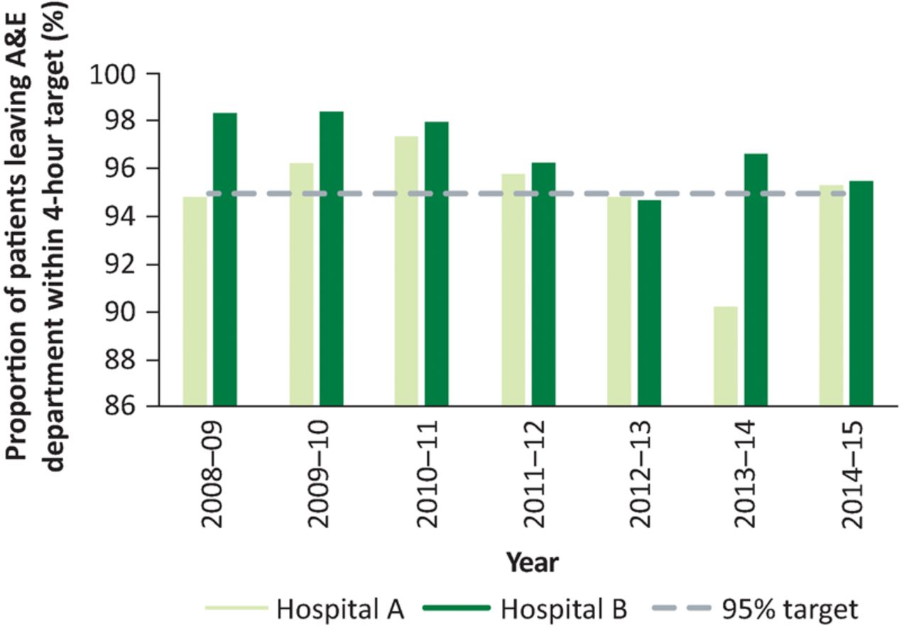
Performance against the 4-hour target from 2008–09 to 2014–15 for the accident and emergency (A&E) departments of Hospital A and Hospital B. Data from NHS Digital.
We then break this information down further and consider the percentages of those leaving A&E in the first 2 hours (ie those who were processed and left the department quickly), those who left in the last 20 minutes (ie those that potentially were rushed through to meet the target) and those that breached the 4-hour target. These categories on their own tell us nothing about the patient's condition when they presented or the appropriateness of the care they received, but we can identify trends over 7 years that offer insight into the operational aspects of the department.
Fig 4A shows the discharge profiles for Hospital A over the 7-year period. The percentage of patients discharged within the first 2 hours dropped from 31.3% in 2008–09 to 21.5% in 2012–13, while those discharged in the last 20 minutes or over 4 hours generally rose steadily during the same period. Since 2012–13, this has reversed significantly with 41.7% patients being discharged in the first 2 hours and 4.68% breaching the 4-hour target in 2014–15. Fig 4B shows the same information for Hospital B. In 2008–09, 57% of patients were being discharged in the first 2 hours, which declined to 32.8% in 2012–13 before rising again to 48.2% in 2014–15. This was mirrored by a rise, and subsequent fall (after 2012–13), in the numbers discharged in the last 20 minutes or after 4 hours.
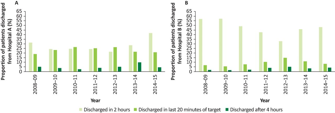
Percentage of patients who left the accident and emergency department in the first 2 hours following arrival, between 3 hours 40 minutes and 4 hours, and patients who had a length of stay exceeding 4 hours for Hospital A (A) and Hospital B (B). Data from NHS Digital.
Critically, while these two hospitals report very similar percentage of patients breaching the target for 4 of the 7 years (2010–11, 2011–12, 2012–13 and 2014–15, Hospital A ranged from 2.65–5.17% and Hospital B ranged from 2.0–5.32%), if we compare the percentages of patients discharged at distinct stages throughout the 4-hour period we see that the A&E in each case is responding very differently. Both hospitals had their worst A&E performance over the first 2 hours of A&E stay in 2012–13 and both recovered somewhat in the next 2 years. Simply looking at the 4-hour target does not give us this information.
The reasons for the way the two A&Es behaved are not evident from the data but this approach furnishes material for a discussion; information that is completely lost when considering the 4-hour target alone.
Breaking the information down further on length of stay in A&E and ‘attendance disposal method’ reveals other interesting information. Fig 5 shows the same data as in Fig 4, but now the discharge destination is also revealed.
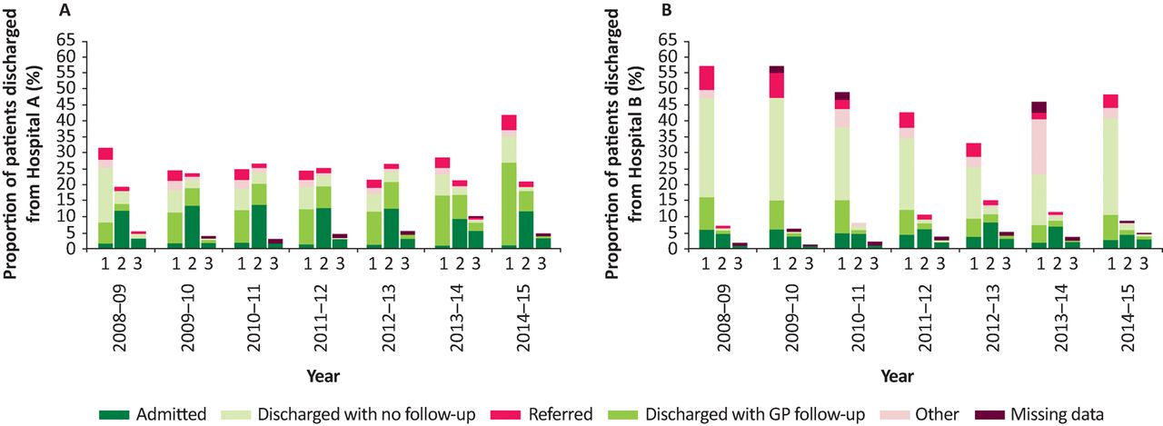
Percentage of patients who left the accident and emergency department in the first 2 hours following arrival, between 3 hours 40 minutes and 4 hours, and patients who had a length of stay exceeding 4 hours by discharge destination for Hospital A (A) and Hospital B (B). 1 = discharged in 2 hours; 2 = discharged between 3 hours 40 minutes and 4 hours (ie in the last 20 minutes of the target window); 3 = discharged after 4 hours. Data from NHS Digital.
If we consider the Hospital A data (Fig 5A), the percentage of patients that are admitted into hospital in the first 2 hours in any year is very low (between 0.92% and 1.68%). The percentage of patients admitted in the last 20 minutes of the 4-hour target window is noticeably higher (between 9.25% and 13.48%), and finally the percentage of patients admitted after 4 hours ranges from 1.59% to 5.63%. This shows that very few people are admitted in the first 2 hours, but of those that are still in the A&E after 3 hours 40 minutes, 53.68% (range 47.86–60.68%) are admitted (ie 15.09% of all patients are admitted after 3 hours 40 minutes). The raw numbers do not explain why this may be the case, but it could be an example of the effect of encouraging staff to adhere to the 4-hour target – effectively encouraging them to ‘admit to decide’.
Additionally, the data show that the percentage of patients that leave A&E in the first 2 hours to GP follow-up has risen approximately fourfold from 6.61% in 2008–09 to 26.13% in 2014–15. Conversely, the percentage of patients leaving in the first 2 hours that have no follow-up has decreased by about half, from 17.11% to 8.01% over the same period. For clarity this information is summarised in Table 1.
Percentages of patients discharged in timespan by destination (Hospital A)
Fig 5B shows the data for Hospital B broken down by discharge destination. In these data, we can see that in 2008–09 the percentage of patients admitted in the first 2 hours is comparable with the percentage admitted between 3:40 and 4:00, but over the years the percentage admitted in the first 2 hours has steadily dropped, while the percentage admitted in the last 20 minutes of the 4-hour target window has risen to a maximum in 2012–13, before dropping back to the 2008–09 level (Table 2). Meanwhile, 59.12% of patients still in A&E after 3 hours 40 minutes will be admitted.
Percentages of patients discharged in timespan by destination (Hospital B)
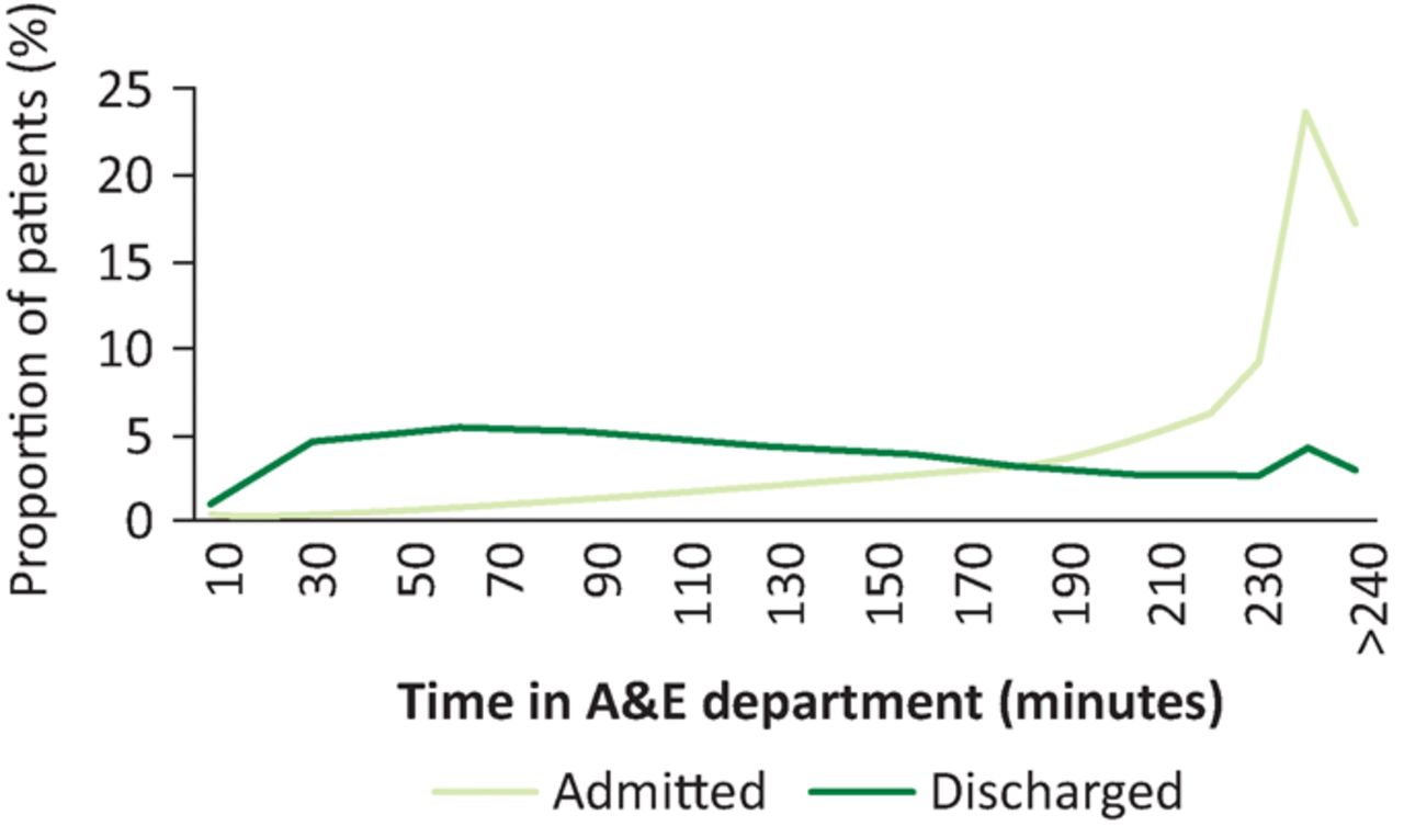
It is also interesting to note how the length of stay profile differs for those patients who are not admitted to the hospital and those who are, and how this has changed over the years. Fig 6 shows the length of stay for admitted and non-admitted patients for all England in 2013–14. The graph shows a distinct peak at 4 hours for admitted patients, but a much flatter profile for discharged patients. The profile is similar for all years and the majority of A&Es, and as a general rule the peak in admitted patients becomes more pronounced with each passing year.

Length of stay in accident and emergency (A&E) department for admitted and discharged patients in England in 2013–14. Data from NHS Digital.
Discussion
We acknowledge that targets can improve performance, and the 4-hour target has driven enormous improvement in A&E provision, as well as standardising service expectations for patients across England. Moreover, the problems that led to its introduction are no longer the issues that they were, and the 4-hour wait is one of the shortest standards in the world. Our contention is that a determination to avoid 4-hour breaches only makes sense if one is also monitoring other parts of the profile; we have suggested those leaving within 2 hours and those leaving in the last 20 minutes of the 4-hour target window.
We demonstrate that simply monitoring compliance with the 4-hour target at the 95% level will fail to reveal much about the underlying behaviour of the A&E by selecting two departments that look very similar from the perspective of the 4-hour target in one isolated year, but that behave differently away from the 4-hour limit, and from year to year. Our analysis of A&E data over 7 years bears out this analysis and reveals further trends, including the pincer movement between fewer people leaving A&E in the first two hours and more leaving in the last 20 minutes of the 4-hour target, which frequently results in more breaches.
The purpose of this paper is not to propose a formula that combines the 4-hour, the 2-hour and the 20-minute flows, but to show what insight can be gained from graphing the trends. We are aware that any such measure would depend upon how patients were classified. At this stage we are content to present the trends and raise the question for discussion.
This approach also provides the basis for a richer discussion between clinicians and managers. It would be tempting to try to understand these trends in clinical terms, such as changing patient mix or flu patterns. However, they might be explicable purely in terms of operational strategies adopted by hospitals and the changing policies to which they have been subjected. We note that A&E is affected by the performance of other areas of the hospital (for instance, the effectiveness of the wards in discharging patients and thus creating capacity for new admissions) and the wider health systems, funding changes or commissioning strategies, and that this information is not contained within the dataset. We present the graphs specifically so that this clinic-operational management discussion can occur in each care setting, taking into account the contextual information that may have affected a particular year's performance against the target. This evidence may inform that discussion, it cannot pre-empt it.
So, firstly, a focus on 2 hours highlights efforts to move more patients through quickly. Raising the numbers of those leaving A&E within 2 hours would have a double impact of lessening the pressure at 4 hours and of lowering the congestion in the meantime. It is possible that a 2-hour internal focus would require further data to be collected and a refinement of the understanding of the pathways within the A&E, but it is less subject to gaming, since a few minutes either way around 2 hours is unlikely to be critical, while the effort to move more people through within the 2 hours would yield tangible benefits.
We note, for instance, that Hospital A had a fourfold increase over the 7 years in the number of patients leaving the A&E to GP follow-up within 2 hours. While the reason for this is unknown, this may indicate difficulties in obtaining GP appointments and raises complicated issues around GP access, decisions to admit patients versus treatment as outpatients or in primary care, as well as between clinicians and hospital managers. It may also indicate changes in how some subgroups are managed, eg the use of ‘see and treat’ for minor injuries or the use of a GP stream within A&E.
Secondly, we have focused on the last 20 minutes of the allowed stay. As A&Es are monitored on their compliance with the target, this interval is characterised by a lack of thinking time and may also be associated with patients ending up on inappropriate wards (so-called outliers). Exception-management is always difficult and getting good decisions under extreme time pressure can be challenging. Therefore, strategies that either ensure that late-leavers have an automatic route to the next stage or that there are as few of them as possible, would be another clear operational benefit.
Finally, this approach focuses on trends and not on points in time. This is important within the A&E itself, where trends enable one to predict and therefore respond ahead of breaches, and in the institution, where near-real feedback of trends can support much closer operational management.
Limitations of the tool include that the data do not become publicly available until the January following the end of the previous financial year and, therefore, is too late to act upon when pressures build. In addition, some of the data have been supressed, particularly in smaller A&Es, which can affect the how the profiles appear on the graphs. However, hospitals collect this data themselves, so could use live data and visualise their performance in this way.
In summary, we have provided a tool that allows analysis of A&E performance over a 7-year period using publicly available data. This analysis looks behind the 4-hour target to analyse how length of stay and method of disposal have changed over time, providing deeper insight into performance, providing hospital managers and clinicians the opportunity to explore potential strategies to improve flow within the department.
Conflicts of interest
All authors are academics whose research is primarily into healthcare services, systems and technology. As such, all apply for grants in this field, publish in this field, sometimes offer training in this field and occasionally undertake consultancy in this field. MC is a practising doctor and undertakes projects for process improvement within the NHS and other healthcare organisations. Apart from this, they all declare no conflicts of interest.
Author contributions
JE obtained the data, performed data analysis and intellectual interpretation, and wrote the paper. MC and TPY performed intellectual interpretation and wrote the paper.
Funding
JE receives funding from the Engineering and Physical Sciences Research Council, grant EP/K037145/1.
Note
A summary pdf of graphs for A&Es in England may be downloaded from www.cumberland-initiative.org/tools/
The authors tweet using the following monikers:
@EDdocUK
@CumberlandI
- © Royal College of Physicians 2017. All rights reserved.


Jump to section
Related Articles
Cited By...
- No citing articles found.